

One Platform, Infinite Stories, Zero Consistency:
Creating a design system for Disney+

Unifying fragmented UI patterns across one of the world's largest streaming platforms.
Timeline
3 months
Core Team
3 UX designers
Tools
Figma, Zeroheight
My Role
-
Research: Content audit, accessibility, company principles
-
Design: Figma foundations, design tokens, components, patterns
-
Deliver: UI kit, documentation, pitch deck
Impact Created
-
Acceleration: Reduction in time spent rebuilding existing components, directly translating to engineering cost savings.
-
Adoption Rate: Number of product screens using Rafiki system components, a proxy for system coverage and team buy-in.
-
Accessibility: Percentage of users who can access the platform as WCAG contrast and interaction standards are met across components.
Meet Rafiki: The Design Language Disney+ Never Had
Rafiki is an unofficial design system built for Disney+. It serves as a shared language: a single source of truth for how the platform looks, feels, and behaves, bridging the gap between designers, developers, and product stakeholders across a complex, multi-brand streaming service. At Disney+'s scale, serving millions of users across Disney, Marvel, Pixar, Lucasfilm, Hulu, National Geographic, and ESPN, inconsistency isn't a mistake. It's inevitable. Rafiki was built to make consistency the default, not the exception.
Outcome
By consolidating Disney+'s scattered UI patterns into a unified component library and living documentation site, Rafiki cuts design and development time while making the platform more accessible to every user.
Like the mandrill from Lion King who's guidance was always followed by the king of Pride Rock, Rafiki was designed to act as a guide for the community to consult when designing for Disney+.
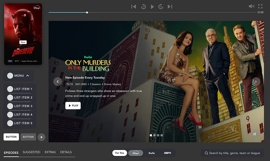
Fig 1. Elements from the updated design system
The cracks behind the magic
To truly gain a better idea of the product and the gaps in it, we began by creating an inventory of the product, documenting the components we encountered across the website.
We then further analyzed the inventory to identify inconsistencies, usability issues and other problem areas. Fragmented typography, colour, and component styles created an inaccessible interface that felt unpolished.

Fig 2. Existing elements of the product


Fig 3. Issues identified within the inventory
Quantified Inconsistencies Found
30+ distinct color values in the interface with no usage patterns
5 different tab/navigation bar styles with inconsistent hover interactions
Multiple button variants with no defined states, sizes, or hierarchy
Icons vary in weight, color, and shape; no unified icon library
No typographic scale; bold/normal, caps/lowercase applied arbitrarily
Designed to Feel, Built to Scale
Before building a single component, the team established five principles to anchor every decision in the system. These were inspired by Disney's guiding principles and named after the wise shaman from The Lion King, a Disney classic.
-
Evoke Emotion First: Every surface should evoke nostalgia, wonder, or anticipation. Design for emotional resonance before information delivery.
-
Champion Storytelling: The UI should recede and let content lead. Layouts, motion, and hierarchy always serve the narrative.
-
Enable Creative Freedom: Components give creators space to innovate, not constrain them. The system supports unparalleled expression.
-
Accessible to everyone: Inclusivity is non-negotiable. Every pattern must work across ages, abilities, and contexts — from a child's first show to a grandparent's favorite film.
-
Premium and Consistent: A cinematic aesthetic must hold across every screen, state, and breakpoint. Consistency is what makes a product feel premium, not any single flourish.
🥹
📖
👩🏽🎨
💪🏽
💰
From Chaos to Components: a shared language for building at scale
Rafiki is structured in three layers: Foundations (tokens), Components (UI building blocks), and Patterns (multi-component templates).
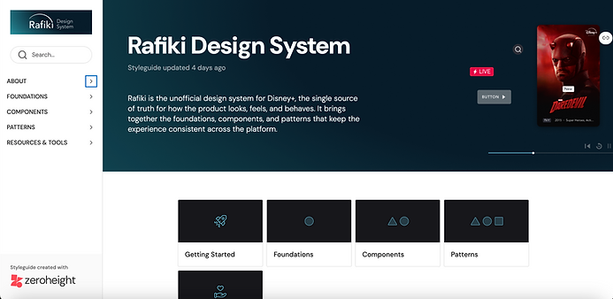
Fig 4. Rafiki Design System documentation
01—Foundation: Every Token Tells a Story
We began with setting spacing, typography and color variables. For spacing, we decided to create a scale starting at 4px, then 8px and increasing in increments of 8 up to 64px. For typography, we defined Display, H1, H2, H3, subheading, body & caption styles, with each style including both regular and bold versions to help create hierarchy and give users more flexibility. Defining color styles was less straightforward as the existing system utilised various tones and shades of the same colors, making it difficult to utilise it as a reference point. So instead we created a list of all the colors utilised- the semantic tokens- to map back to the primary tokens.


Fig 5. Spacing, Typography, Color tokens
02—Components: UI Building Blocks
In our deconstruction, we found that there were inconsistencies across these various components and their states, so we set out to standardise them so users would be able to differentiate where and when to use them. the first issue we tackled was creating uniformity amongst tags and icons. Next, we standardised navigation bars and their hover states, which changed across the website. We also simplified the existing button ecosystem to define primary, secondary and icon buttons with similar hover and focus states, This also helped define the purpose of each button, whether it would open a new page or controlling actions on the same page. Lastly, we created cards with toggleable properties so designers could adjust existing components instead of building from scratch.


Fig 6. Icons, Tags, navigation Bars, Buttons, Cards
03—Patterns: Building with Levity and Brevity
To help designer build pages with ease, we created patterns- templates made up of multiple components. We focused on building those patterns that appear repeatedly across the website, like hero banners, carousels, and content blocks.
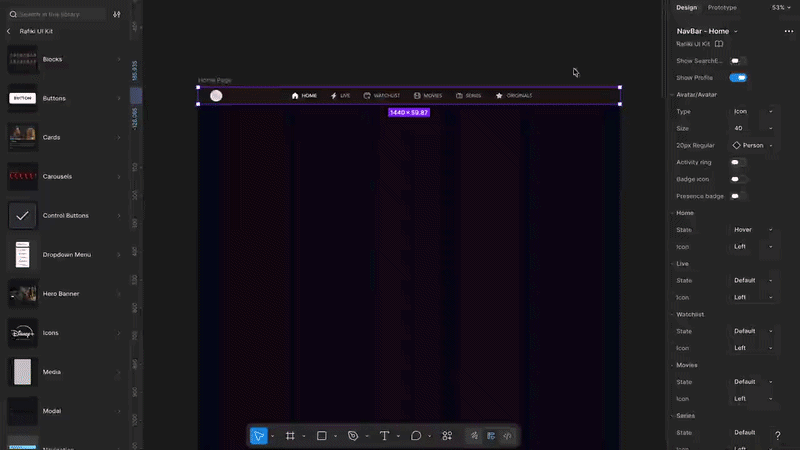
Fig 7. How to use patterns to build
We Built It. Then We Put It to the Test.
The UI kit was tested with other designers before launch. Participants were asked to recreate either the Disney+ homepage or show detail page using only the Rafiki UI kit, thinking aloud throughout. These pages were chosen because they require multiple component types and force thorough exploration of the system.

Fig 8. User testing for the UI kit
Key Findings from Testing
-
Users mostly completed the task successfully
-
Remaining inconsistencies found in element sizing, components needed more responsive rules
-
Grids and margins were unclear, spacing needed more explicit definition
-
Naming conventions were confusing in some elements; purpose wasn't immediately clear
-
Some elements were missing entirely; points to gaps in the system's coverage
Built for Everyone, Documented for Anyone
The UI kit was published on ZeroHeight to ensure all stakeholders, from designers & developers to product teams and managers, could access the system and its guidelines independently. The documentation acts as a north star for anyone interacting with the system- giving them component variants, anatomical breakdowns, usage and accessibility guidelines. These guidelines give them rules required to create within the system while still having the freedom of making their own components and patterns.
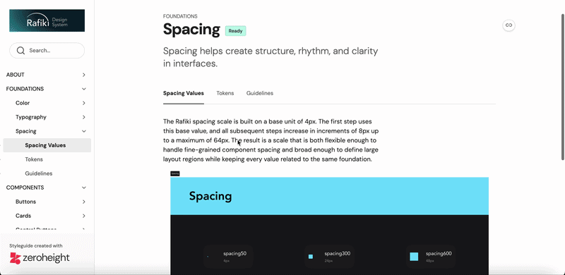
Fig 9. Foundation documentation
Additionally, the documentation site has a Help & Support page so stakeholders can flag issues or seek clarification outside of a design review, a References & Downloads section to help teams build competency with the tooling required to use the system, and a Contribution policy making the system a living document rather than a static artefact. Having documentation detailed out this way helps in the onboarding process for newcomers and acts as a reference manual for existing users that may run into any issues.


Fig 10. Contribution policy, Help & Support and References documentation
Our pitch was well recived by stakeholders
Through our pitch deck, we were able to communicate our ideas, reasoning and design decisions to stakeholders, showing them why a design system matters and how they would benefit from implementing it. They were receptive of our ideas and understood its long term value.

Fig 11. Team behind the project- Sriya Benjaram, Pragya Lohia, Uraiba Zafar
My Takeaways
-
Cross-functional work trumps technical skills: I came for the components. I stayed for the systems thinking. Rafiki taught me that great design systems are less about pixels and more about the decisions, documentation, and collaboration that hold them together.
-
Design is conditional: Two people on the same team could have two different but correct ways of thinking. It does not mean that one is necessarily wrong, rather that there is one solution that would work better than the other. This is a question that a design system would be helpful in answering.
Additionally, I would like to thank my two teammates- Sriya and Uraiba- who were the best collaborators and made this project a joy to work on!