

Timeline
10 weeks
Core Team
3 UX designers
Tools
Figma, Google Suite, Miro
My Role
-
Primary research: interview & contextual inquiry
-
Working with team members to reorganise sitemap and information architecture of existing app to reflect design considerations
-
Designing proposed pages,
Impact Created
-
Successfully ideated and created high fidelity prototypes that allowed users to easily perform tasks.
-
Addressed user's issues by creating a contextual, personalized, and actionable learning module.
-
Established starting point for future expansion.
Reframing Mobile Banking:
Adding clarity to financial literacy tools available to college students and early professionals
Reimagined Chase's mobile banking app, simplifying financial information into actionable interactions and digestible content to build user confidence by creating better functionality for chatbot experiences and a resource hub for educational tools like videos and quizzes while maintaining brand identity across screens and interactions.
Overview
This project reimagines Chase’s mobile banking experience to better support financial literacy—an area users struggle with despite heavy reliance on banking applications. The goal was to create a mobile experience that brings financial learning into everyday banking and making it clear, contextual, personalized, and actionable.
Outcome
Redesigned application navigation, architecture, and design to better reflect user's needs, including a resource/learning hub, restructured chatbot and homepage.


Fig 1. Redesigned screens from our final prototype
The Challenge
Early job holders and international students want to better their financial literacy but find that educational resources available to them are difficult to find within their existing banking application structures. Additionally, the content they do find feels intimidating, not engaging, and lacks contextual guidance on practical application.


Fig 2. Existing screens from Chase's mobile app
We chose to work on redesigning Chase's mobile app because we found that it was one of the most popular banking institutions for early job holders, especially international students who are learning and starting to build their financial resources in the country. We also found that users had a lot of issues with the way that Chase's application was structured and found it too complex to navigate, making for a less than ideal experience.
Secondary Research
To better understand our users and their needs we conducted secondary research into the tools that were readily available to users. We found a lot of variation in how financial literacy was defined, but for the purposes of our project we aligned ourselves with an operational definition:
"Financial literacy is the ability to make informed judgments and to take effective decisions regarding the use and management of money."(Kimiyaghalam & Safari, 2015)
We also found that U.S. policies require that banks support the community's financial well-being by meeting their credit needs and providing education and counselling services.
Finally, we examined Chase's resources and Financial Education Center, and found that a majority of the content lives outside of the app's infrastructure, and that the in-app features that are available lack the required visibility on the surface, making it hard for users to effectively navigate.
Primary Research
To better understand how our users encounter and use their financial resources in both physical and digital spaces, we conducted observations, contextual inquiries and interviews with our target demographic.
From these research methodologies we found that:
-
Users rely primarily on their apps for most of their financial activities from budgeting to tracking their spending and credit score.
-
Learning tools exist, but users are not sure how to access them as they seem to be hidden deep within the app.
-
The digital assistant is sometimes helpful but not very easy to find.
-
Users prioritized quick, clear, and trustworthy answers.
-
Complex navigation and information architecture creates an unnecessary cognitive load on users which steers them away from utilizing the app at all.
Analysis
From our research and key findings, we were able to develop a user persona, user journey map and mental model.

Fig 3. User persona
This persona was created based on the understanding of existing users through research, user interviews, and competitors’ knowledge. Her name is Maxine Hsu, a 24-year old first-year graduate student from China who is a digital-first user that uses a major bank app and needs quick, trustworthy, plain-language guidance to take early steps toward financial confidence.

Fig 4. User journey map
The user journey map was created based on how we wanted the user's ideal experience to go when interacting with the app, and is based on the research we gathered. We found that the Question-Review-Evaluation phase could create a loop, presenting a major opportunity for us to create a bridge that smoothens the process.

Fig 5. Mental Model
We sorted our findings from our research into a mental model to define what the users want from the application. These intents must be supported by our design decisions in a direct manner through contextual learning.
The Solution
We established four principles to guide our design decisions:
-
Personalization: The app adapts to the user’s goals, credit status, spending patterns, and experience.
-
Visibility: Financial learning is surfaced where users can see it rather than hidden in menus.
-
Transparency: Clear language, clear explanations, clear navigation.
-
Active Learning: Videos, quizzes, and progress indicators to support real time tracking and upskilling.

Fig 6. Existing Sitemap
The key restructures we kept in mind to let us validate flows before designing screens:
-
Introducing the Plan & Track page, a new personalized financial literacy hub
-
Repositioning the Digital Assistant as more persistent, a top-level entry
-
Consolidated Snapshot into the landing page for easier access
-
Streamlining Spending page with clearer charts and separated views
-
Added Financial Literacy Banner on the landing page for easier access to Plan & Track page
-
Organizing educational content by topic and resource type so users can sort as they want to

Fig 7. Updated Sitemap

Fig 8. Updated Information Architecture
High-Fidelity Design
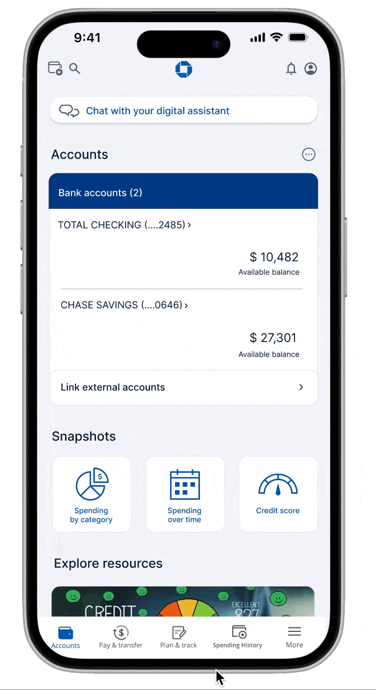
LANDING PAGE
The key changes:
-
Full-width Digital Assistant bar: users' found it difficult to find an icon in a corner
-
Addition of Snapshot: users can see spending and credit score at a glance, consolidating insights
-
Financial Literacy resource banner: highlights educational tools for users' easy access
-
Updated navigation to reflect usage: “Spending History” replaced “Offers” in the bottom navigation to reflect more frequently visited page

Fig 9. Existing Landing (Accounts) page
.png)
Fig 10. Redesigned Landing page
DIGITAL ASSISTANT PAGE
The key changes:
-
Help icon: an onboarding guide to help user familiarize themselves with the chatbot
-
Suggestion prompts: powered by system logic, this enables users to quickly select common queries and receive answers without needing to type entire questions
-
Chat with Real Agent: addresses users' concerns who prefer call support over automation
-
Microphone Input Option: to give users a more accessible interaction alternative to typing

Fig 11. Existing Digital Assistant
Fig 12. Redesigned Digital Assitant
CREDIT SCORE PAGE
The key changes:
-
Credit Score resource banner: direct link to learning resources allowing users to immediately access related learning modules, turning the page into an educational touchpoint
-
Personalized recommendations: based on the user's financial standing, users are shown bite-sized explanations of what affects credit, guiding them to actionable steps
Fig 13. Existing Credit Score Page

Fig 14. Redesigned Credit Score Page
PLAN & TRACK PAGE
This is the the cornerstone of the redesign, including:
-
Learning Tracker allowing users to set goals for themselves: ensures the experience is personalized to the user’s needs and they can pick topics relevant to their interest
-
Progress bar: each individual goal shows the user what they have completed and how much they have remaining in percentages
-
Explore resource by topic or type: A section to explore resources depending on users' preference, allowing users to interact with topics relevant to their current context and resources helpful to their personal needs
-
Talk to an Expert: users that prefer to talk to an advisor can do so from this page directly

Fig 15. New Plan & Track Page
EXPLORE BY RESOURCE: VIDEO
Previously, all videos were on one page, with the main video playing. To make this easier for users to understand, we made the following changes:
-
Multiple pages, sorting filter: show users all the videos available and give them a filter option to sort by topic, making it easier to access resources relevant to user interests
-
Digestible information: Video under 10 minutes to ensure the user stays engaged and the information is given in smaller, more digestible chunks
-
Similar recommendations: users can access those instantly on a video page
-
Clear content: each video has short descriptions telling the user what to expect so they can judge whether it is relevant to their needs
Fig 16. Existing Video Page

Fig 18. Video Page with filter

Fig 17. Page showing all videos

Fig 19. Page showing selected video
EXPLORE BY RESOURCE: QUIZ
Making interactive quizzes available in the app helps encourage active learning:
-
Sorting filter: show users all the quizzes available and give them a filter option to sort by topic, making it easier to access resources relevant to user interests or needs
-
Tracking and difficulty details: quizzes that are complete will have a check mark so users can keep track of their progress, each quiz also has relevant difficulty, description and time information
-
Similar recommendations: users can access those instantly on a quiz page
-
Clear content: each quiz has short descriptions telling the user what to expect so they can judge whether it is relevant to their needs
Fig 20. Page showing all quizzes

Fig 21. Page showing selected quiz
EXPLORE BY TOPIC
Users will have the option to explore resources only related to the topic of their interest through:
-
Personalized learning experience: users cant select what topic seems relevant to their current context and explore those
-
Separated resources: two sections grouping similar types of resources together

Fig 22. Explore by topic - Credit Score
Accessibility Testing
For this project, we conducted visual contrast testing and aimed for AA level conformance. We used tools like WhoCanUse and Contrast (Figma Plugin) to check what level of conformance our prototype had. We then used Venngage to generate variations of color palettes using an existing color in our system as a starting point.

Fig 23. Proposed color palette
After conducting the testing, we came to the following conclusions:
1. Our current color palette seems to pass the AA rating test at the very least.
2. The main pain point was some blocks of grey text failing to pass the test due to a low level of contrast.
3. We changed that to a darker grey or blue, depending on the context.
4. The palettes generated through Venngage were also very similar to the palette we originally had.

Fig 24. Venngage generated color palette
Usability Testing
We conducted usability tests to check how effective our design decisions were. We had 6 participants from the user group (early job holders and students) to perform 2 tasks:
-
Using the Digital Assistant and chatbot prompts, check credit score and find a video.
-
Find the top spending category for this past month.
Each session was approximately 20 minutes and was conductedusing the high fidelity Figma prototype on a phone.
POSITIVE FEEDBACK
-
Chatbot prompts: predefined options seem easy and efficient
-
Spending visuals: easy to understand, appealing visuals, trend chart was helpful
-
Credit score recommendation: advice felt relevant, applicable to situation
PAIN POINTS
-
Chatbot bar: using a bar instead of speech bubble was confusing and reduced visibility for some users
-
Spending visuals: time-frame filters need better hierarchy for clarity, more customisation options for data visualisation outside of bar and donut charts
Future Scope
-
Improve scannability on visually dense screens: reduce cognitive load across high-density pages by refining hierarchy, spacing and overall structure
-
Strengthen onboarding: create tutorials/first time guides with situational prompts and contextual tips for progressive learning
-
Expansion of Plan & Track ecosystem: deepen progress tracking with interactive budgeting sliders, multi-layered progress visualisations, micro-challenges for a more structured goal setting and tracking flow
My Take-aways
Design concepts remain relevant throughout the process: I found that it was extremely important to keep these at the forefront of the process, as they affected almost all the decisions we made. Keeping these in mind also centers the user in the process, building a product that actually fits their needs.
Users' contexts are essential: Understanding the users' context and expectations helped shape our plan and goal for what we wanted the final result to be, and will continue to affect future iterations.
Clear expectations, roles and collaboration are crucial: Speaking with my teammates about the process, what we wanted the final product to look like and building off each others' work became very important to achieve our goal. Having clear instructions and expectations also helped align the team's vision and understanding of the task.